
What Do the Dotted Lines on the Metrics Dashboard Mean?
The dotted vertical lines on your template analytics charts mark template events — points in time where something notable happened to the template.
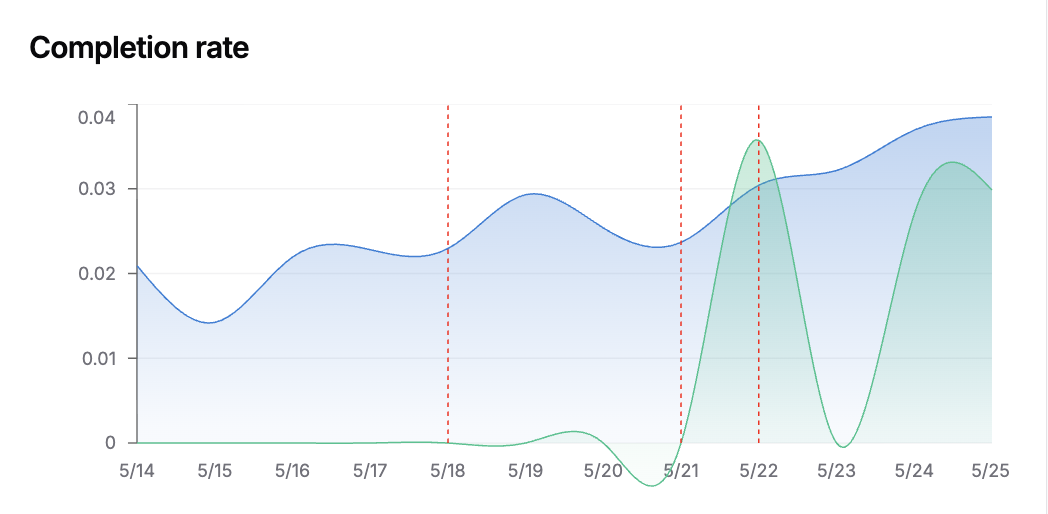
Red vs Blue
Section titled “Red vs Blue”- Red dotted lines — a regular template event happened on that date. This is most often a copy change (new variants generated, variants edited), but it can also be a configuration change, a status transition (e.g. shipped), or a manual marker that someone added from the chart’s “Add marker” dialog.
- Blue dotted lines — a reversion was recorded on that date. Reversions reset the experiment’s effective start date, so a blue line marks where the current reporting window began.